Father’s Club Branding Kit
OUR LOGO
In 2018, the founding members began using an image of Navy Seals “locking arms” to represent the Father’s Club. One of the tests these men endure requires them to sit in the cold water and link themselves together by locking arms with one another. Through this process of locking arms, the men were able to encourage one another and add support to the entire team. This physical bonding created a special emotional bond.
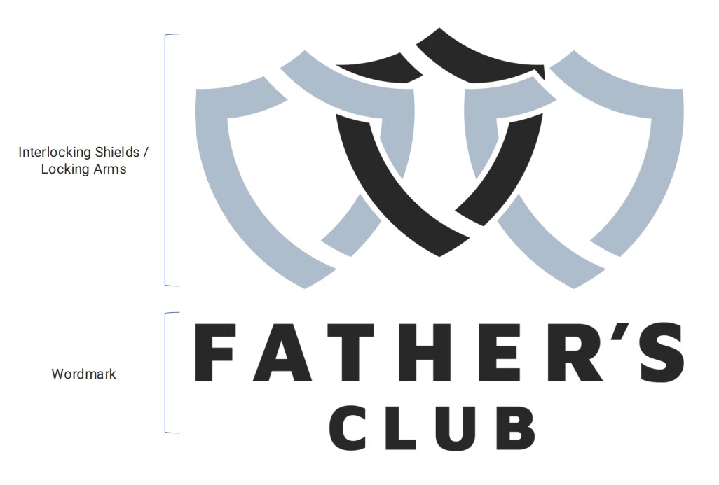
The Father’s Club wanted to embody this idea and apply it to fathers. Our logo represents a modern and simplified symbol of courage using interlocking shields and locking arms to face the daily battles we endure in our lives.
When we lock arms:
- We become an unbreakable force
- We stand together against the things that attempt to destroy us
- We are able to encourage one another
- We add support to all fathers
- We create a physical and emotional bond with one another
LOGO ELEMENTS
This is our official logo to be used for all brand-level marketing and communications.
The Father’s Club logo, consisting of the three shields and custom wordmark, is designed with a precise balance between the elements. Logo elements may not be altered or edited in any way.
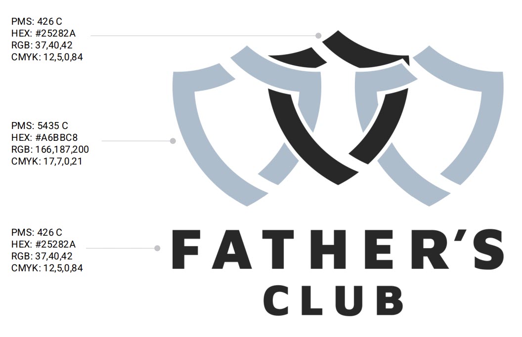
Our logo is made of two colors: a blue-grey and black.
The logo usage guidelines provided in Branding Guidelines PDF (below in the Downloads section) must be maintained both internally and externally to ensure proper application and maintain consistency for our brand.
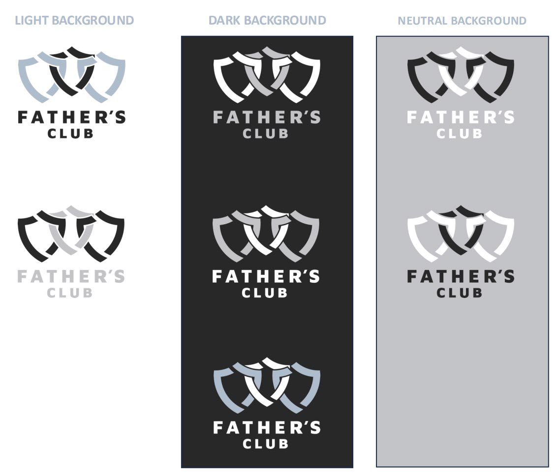
LOGO VERSIONS
Light Background
Dark Background
Neutral Background
Solid Color Variations
